Bar charts
A bar chart report starts from raw per-entity bars and can then optionally group and aggregate them. For example:
- Application count by capability.
- Total application cost by capability.
- Average risk score by owner.
- Count of applications by lifecycle stage.
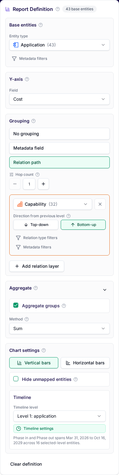
Choose the base entity set, usually a numeric or time period y-axis field, then use the grouping section to keep raw bars ungrouped or visually cluster them while optionally changing the x-axis label field from its default name. If you only want grouped entity count, the y-axis can stay empty. Use bar charts when you need comparison, prioritization, or a simple executive summary. If the shape of the architecture matters more than a total or ranking, use landscape reports.
Built-in templates
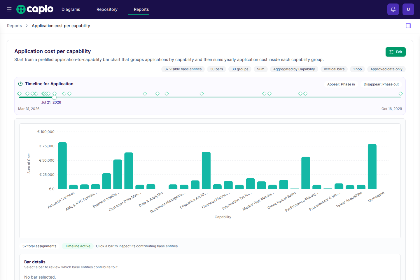
Built-in templates can also open directly into a ready-made report. For example, reports/application-cost-per-capability starts with applications grouped by related capabilities and then sums yearly application cost inside each capability group.
Building a bar chart
The editor now follows this flow:
- Choose the base entity type.
- Choose the numeric or time period y-axis field, or leave it empty if you only want grouped
entity count. - Review the
Groupingsection. It defaults toNo grouping, and the x-axis field defaults toname. - Optionally switch grouping to a metadata field or a relation path. Metadata grouping only needs the selected grouping field; relation-path and ungrouped charts still let you choose the x-axis field separately.
- Optionally enable
Aggregateto collapse each visual group into one bar.
Without aggregation, the chart keeps one raw bar per x-axis item and only visualizes the grouping. With aggregation enabled, each group collapses into one bar using entity count, count distinct, sum, or average. You can also hide unmapped entities if you do not want an explicit Unmapped bar or group in the result.
Grouping by related entities
When a bar chart groups by related entities instead of plain metadata, it uses the same relation-path, direction, and hop-count rules described in Reports overview.
The bar-chart-specific difference is grouping: one base entity can contribute to multiple visual groups if it reaches multiple terminal entities through the configured path. This is useful when, for example, one application supports more than one capability.
If you then enable aggregation, that same entity still contributes its full value to every related group it reaches. Bar charts do not use the Auto nest children option that landscape and roadmap reports support. Relation-path grouping in bar charts always follows the explicitly configured layers and hop count only.
Timeline sliders
Timeline sliders filter the chart based on date fields. This is useful for showing what is active today, what appears in a future roadmap, or what disappears after a retirement date.
A bar chart has one active timeline layer at a time. You can target the base entity layer or, for relation-path groupings, one of the related layers. When a related layer drives the timeline, base entities stay in the chart only when their rendered relation path still reaches a visible related entity.
Saving bar charts
Save a bar chart when it answers a recurring question. Shared reports should have clear names and stable filters so teammates can trust them.